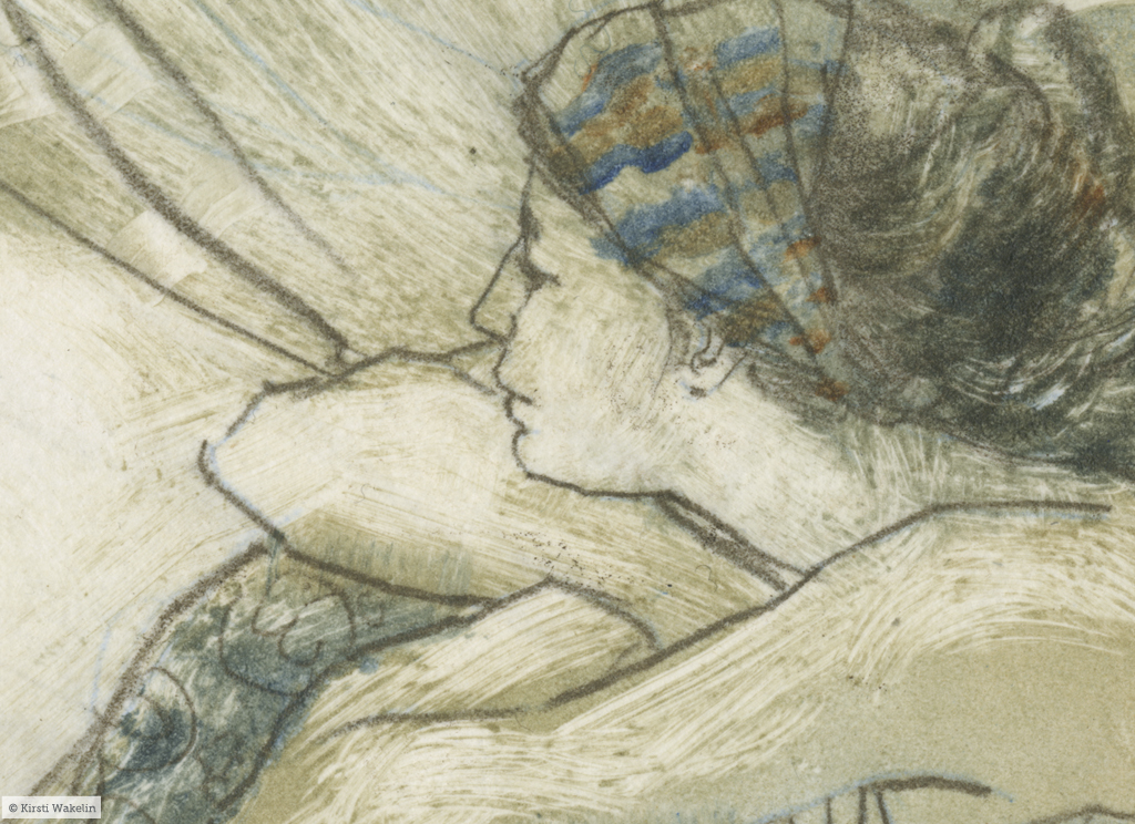
The Garden | oil monotype and chine colle on BFK Rives | detail
I took a monotype course recently at Dundarave Print Workshop with instructor, artist Heather Aston. Except for a short screenprinting class I took last year, this is the first instruction I’ve had since college and it made me all kinds of nervous.
My previous experience with printmaking is limited to a few single colour linocuts in college, but I’ve always been interested in exploring it more because I like the idea of working with a subject over and over but in a more immediate way than my fumbles with paint will allow. Originally I was intrigued by screenprinting, but realised after my experience with it during the course I took that it involved more studio, storage and cleanup space than my current situation allows. And I really wanted something that was a bit more immediate, without as much setup and cleanup time. I am still interested in pursuing it further, but not with my current lack of studio space (or time).
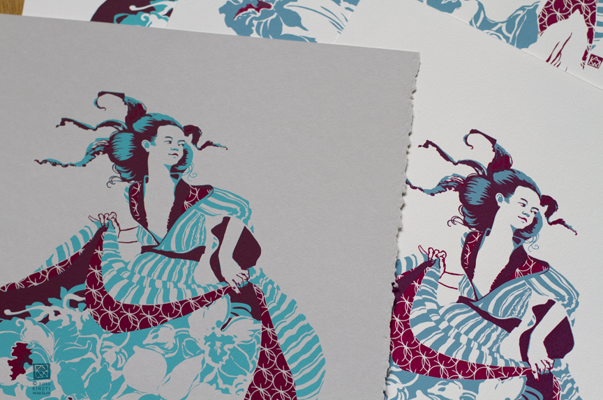
The Garden | serigraph
I turned to monotypes to quickly test compositions for paintings and as a way to go back to the basics with value studies for painting reference. I wanted to free myself from the crutch of colour photo reference I’ve begun to rely too heavily on. I also spend a lot of time in my job working on the computer doing fiddly things, so the appeal of working so directly with ink and producing something that has an certain amount of unpredictable results is really appealing.

Driftwood, Rock, Crows | study for painting | oil monotype on rag paper | detail

Crows Rock Drifwood | work in progress | oil on canvas | detail
For a while I muddled my way through making monotypes by learning from a mixture of failed attempts, book-based learning, and YouTube videos. Without a press, I pulled prints with a rolling pin and wooden spoon. The results were ok, but sometimes inconsistent and at a certain point I figured I’d get more out of the process if I could learn the right way of doing things without having to make more mistakes, or guess why things did or didn’t work.
I really enjoyed Heather’s class. I got exactly the technical info I needed and more, as well as a chance to print with a press, which makes a world of difference. The class was also fulfilling because the other students were so enthusiastic and their experiments with the medium added another dimension to the course that I had failed to predict.

lift prints | ink on rice paper
Heather introduced us to chine colle with lift prints, which I absolutely love. I gives me a way to incorporate drawing into my printmaking in a way that is more natural to me. And I love the fuzzy quality of the line that edges a bit toward the feeling of drypoint.


Mandragora Queen | monotype with chine colle process images
Throughout the course I did a lot of fumbling and hesitating and went through all sorts of confusion on how to approach applying ink, making marks, and choosing colour. There were lots of mistakes that were informative but weren’t very pretty. Then I made a few mistakes I found really exciting. By the end of it I made a few of those mistakes again, but on purpose, and figured out a way of working that makes sense to me. The experience also introduced me to a different idea of how to approach painting and opened me up to allowing the unpredictable into my painting process as well as gave me some ideas on how to make some good mistakes on purpose.