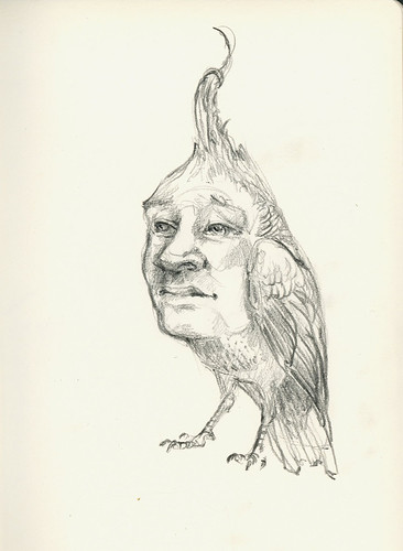
New work – preview

I’ve had a lot of projects on the go over the last few months. But as they’re all ongoing, I can’t quite post them yet. However, here are some of the sketches for the very newest project that might actually be done and installed before all the rest. This image is fitting because it looks like it’s just begun to snow in earnest here and the roads are covered with the first of tonight’s forecasted 15cm.

Edit: the final work is here.

Sketchbook – Go By Bus

Go By Bus | pencil, digital & ephemera

This is a little Photoshop exercise using a doodle from one of my sketchbooks.

original sketch | pencil

This creature needs a name along the lines of this fish – the sarcastic fringehead. The sarcastic fringehead was on the recently aired ‘Fish’ episode of David Attenborough’s Life and I’m not sure what delights me more – its name or its looks.

Here’s another clip of a pair of battling sarcastic fringheads.

MOV Art of Craft exhibit design

Following the design of the MOV Studio, Darren Carcary and I began the process of designing an upcoming exhibition of craft at the Museum of Vancouver. The exhibit spans three gallery spaces and will highlight works from Canada, BC and the Republic of Korea.

The design process is now into the final leg – the galleries have been painted and the exhibitry built and we’re now focusing on the finalisation of type graphics as well as a film component that we’ve built into the design. More on this project soon…

Using Design for Good

Everything has been tinged a little green these days, including design. There is plenty of information about it how to do it, plenty of books written about why, and plenty of talks and discussions by people who are practicing it. Clients are now demanding it, paper companies have created more sustainable product lines in response to it, and some design firms are specialising in it. In the past, greener design was seen as an expensive extra, but these days there are examples where it can make good economic sense. There are also options at all levels of the design process where more sustainable choices can be made.

Practivism 2008

Last year I attended GDCBC’s first Practivism event where three speakers discussed their experiences with practical activism in relation to green design within their design practice. It was an enlightening and encouraging evening. I came away with a new way of looking at design and a commitment to making better design choices. I was especially impressed by Brian Dougherty of Celery Design and the studio’s concept of designing backwards. I immediately read his (and celery design’s) book Green Graphic Design cover to cover and put what I read into practice on the first project at hand – the MOV Studio design. It was an enlightening ride through a forest of supposedly sustainable options. I don’t think I would have been able to make proper sense of things without the book as a guide. I found that while there are a lot of new sustainable options when it comes to printing substrates, not all are what they seem. Recycled vinyl is still vinyl. Its final resting place is still the landfill – for a very, very long time. And for some materials there are no, as of yet, good solutions. As designers we have to be savvy when it comes to labeling. Design isn’t just about graphic design any more – design is the whole process. Including the part we don’t think we’re part of – the beginning and end of the materials we are utilising.

Practivism 2009

This brings me to the whole point of this post. Practivism is back for a second year. This time the focus is on social sustainability. Environmental sustainability has been a buzzword for some time. I’m pretty sure, when asked, most people could tell you what it is and give an example of a environmentally sustainable initiative. But what about social sustainability? And what is our role as designers in that?

The speaker line-up is impressive: Andréa Pellegrino (Worldstudio), Nathan Shedroff (Design is the Problem), and Kara Pecknol (IDEO Human Centered Design Toolkit) and the location this year is the Museum of Vancouver, a fitting place to begin a discussion about what design’s role in social change can and has been.

Join the discussion on November 19, 2009.  The itinerary is as follows:

Cash bar/ snacks/ MOV exhibit tours: 5:30pm – 7:00pm
Speakers/ Dialogue: 7:00-9:00pm
Reception: 9:00-10:30pm

Full event, speaker and ticketing details on the Practivism website.

Sketchbook – Fox

Fox - ink sketch

Fox | ink + digital

I’m starting to experiment a little with approaches to colour for the book I’m working on. I’m neck deep in working the drawings out still so I haven’t allowed myself to fully delve into playing with ink and paint yet. But this was a quick little 15 minute thing I whipped up this morning. After labouring over getting drawings right, it’s nice to just ignore that aspect completely and just play with an idea.

The Canadian Design Resource Blog

The Canadian Design Resource blog

Thank you to the kind folks at The Canadian Design Resource blog who recently blogged one of the illustrations I created for lululemon athletica last year.

The CDR has become one of my favourite blogs recently as it showcases such a range of all types of Canadian design and illustration both contemporary (and quirky) and delightfully retro. There are hay balers and overpasses, trivets, beer packaging, Newfoundland dogs and everything in between.

The canning jars are a particular favourite of mine since my boyfriend and I made our first foray into canning by making refrigerator pickles in his grandmother’s old made-in-Canada glass-lidded canning jars:

.

While on the subject of Canadiana, I have to sneak this stamp design in:

Lorne Greene is 51 Cents

Sad

Back when I was a graphic design and illustration student, the illustrators in my class were almost unanimously united in worship of the paintings of Bernie Fuchs. A class trip to New York found a group of us sitting on the floor of the Illustration House Gallery with our noses mere inches from his original paintings that had been kindly brought out from the storage room and propped around the floor for us.

Upon purchasing a collections of posters at another illustration institution there, I found they had been rolled up and packaged for me in a mailing tube that had previously housed one of Mr. Fuchs paintings. His name and studio address were still affixed to the tube.

Bernie Fuchs died last night.

New work – MOV Studio Design

There was a mummy and a bicycle, a cougar and a beaver, as well as an (abridged) time-line of the history of Vancouver and the world. The floor was concrete so the acoustics were awful. The space was cluttered, confusing pathing and overwhelming the room – were the exhibits to the left or right? The Orientation Gallery at the Vancouver Museum needed a redesign; the Vancouver Museum was becoming the Museum of Vancouver. The brand was new and ready to be launched, the museum’s direction had been redefined and great new exhibitions were planned for the future (Velo-City was opening soon). The Orientation Gallery was soon to undergo a change of name and floor covering.

.

DES_MOVST_comp1.1

.

Continue reading